Designing the Vehicle Controls Framework for Ford and Lincoln vehicles.
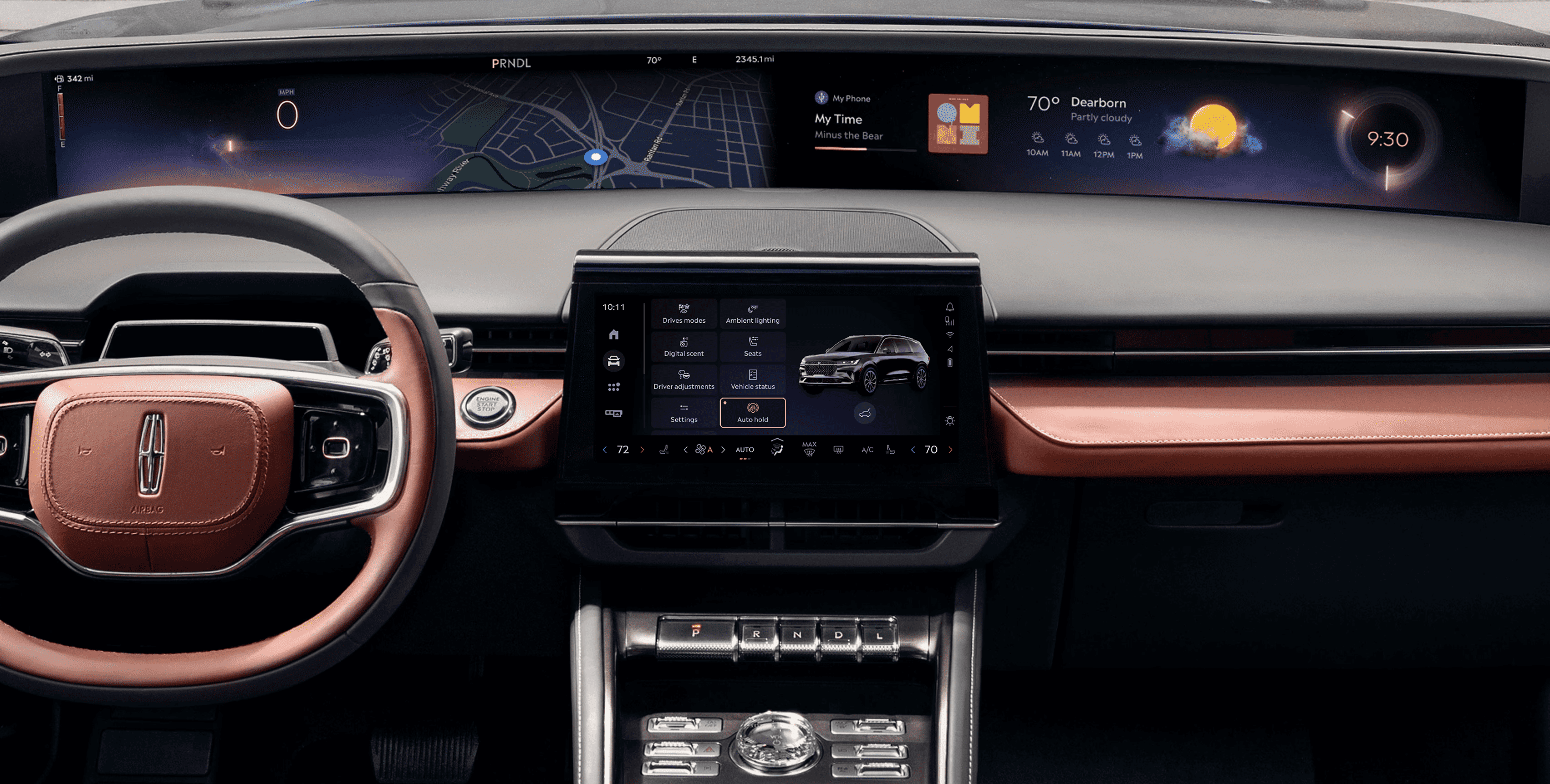
One of the first and most important problems I started working on, immediately after joining Ford, was to develop a UX framework around a single question - “How do we bring the most important vehicle controls within two touches for the user?”
Problem
Essential vehicle controls, like opening the trunk or adjusting seats, were buried in complex menus, making them hard to access quickly. This led to driver distraction and frustration.
Outcome
I designed a streamlined controls framework from 0 to 1 that grouped commonly used functions into an intuitive interface. This reduced navigation complexity, improved accessibility, and ensured a safer, more seamless driving experience.
The process
Using the Double Diamond framework, we identified user pain points, explored solutions, and refined designs through testing - ensuring quick, intuitive vehicle controls with minimal distraction.
What we learned from users
Collaborated with product teams, analyzed interfaces from leading automakers using Screens Studio, and gathered insights into the most frequently used controls and frustrations by conducting surveys. Here are the main findings.
Overwhelming menus
Users felt frustrated navigating through deep, complex menus to access essential features like traction control or seat adjustments.
Prioritization gap
Drivers wanted fast access to frequently used controls, but these were often buried under less important settings.
Distraction concerns
Users expressed concerns about the time and attention required to interact with the system, especially while driving.
Early explorations & flows
A collection of initial ideas, layouts, and user-flows that I sketched using user insights and Ford OS design principles.

Iterative decisions and rationale
Key design decisions focused on layout, controls, and the transition from 2D concepts to 3D vehicle models.
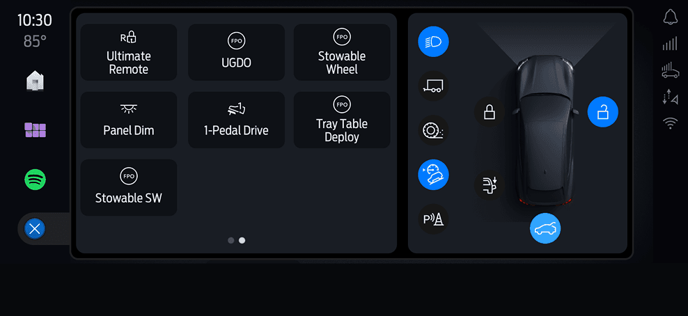
Left vs right aligned access panel
Driver ergonomics. While driving, the left side of the screen is easier to reach, so we reserved that area for frequently accessed in-drive functions.
Context of use. Access controls (opening the trunk, the charging port) are mostly used when parked. Placing them on the right side created a clear separation between in-drive and parked-state functions.

Control density & layout
Too many controls created choice paralysis and interfered with cognitive ease and driver safety. We reduced density and moved to a 2×4 layout after testing showed that users struggled to parse tightly-packed grids while driving.
We also explored grouping features into subcategories, but avoided it unless the volume of features truly demanded it. Fewer controls didn’t justify extra layers - a flat architecture served better for speed and recall.
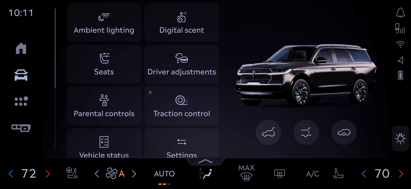
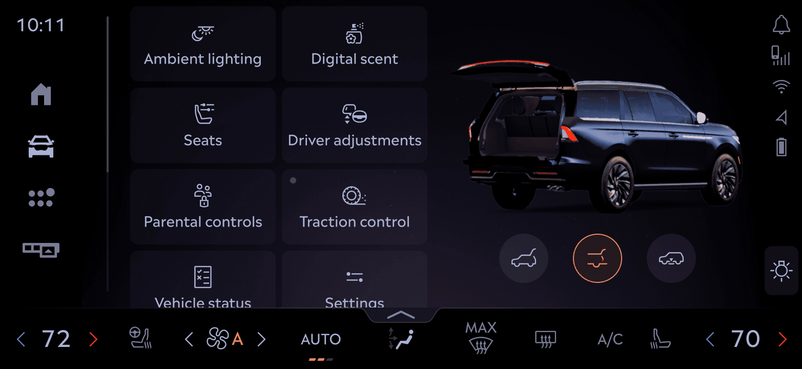
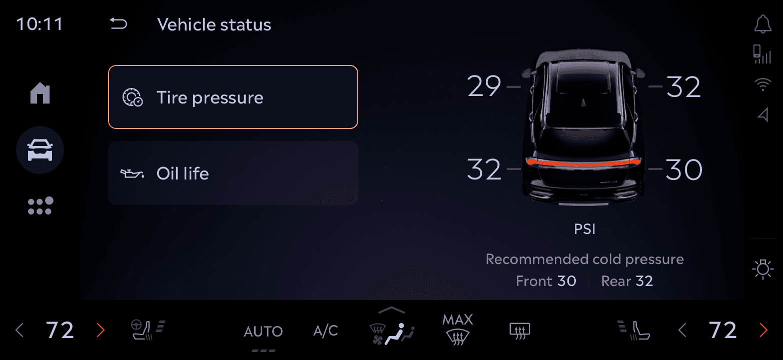
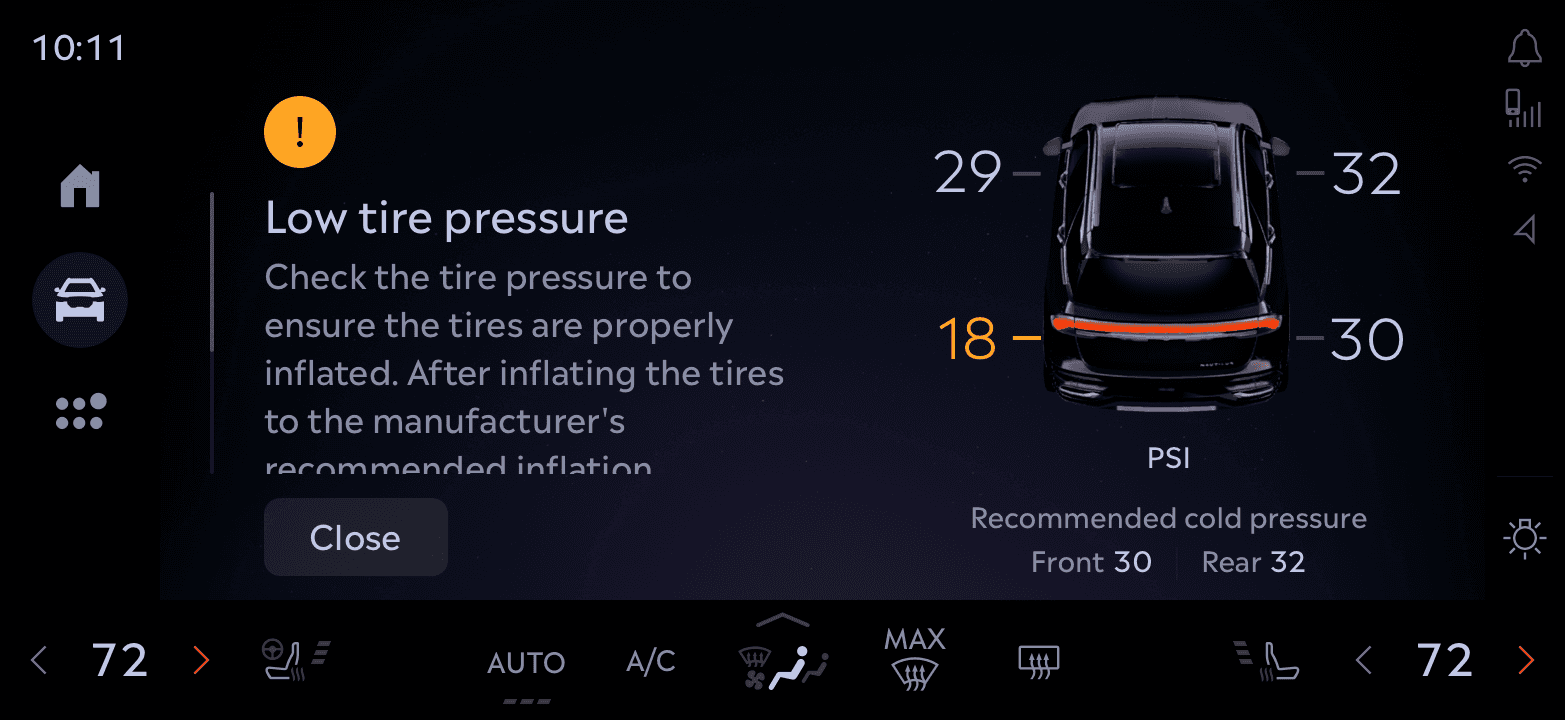
Vehicle avatar integration & feedback
Rather than a flat control list, some features used the 3D avatar to mirror real-world actions - opening or closing the trunk, vehicle status. This was a systems-level interaction decision that improved learnability and discoverability over static UI.
The avatar became a core part of the control experience, grounding the UI with a spatial, real-world reference point.
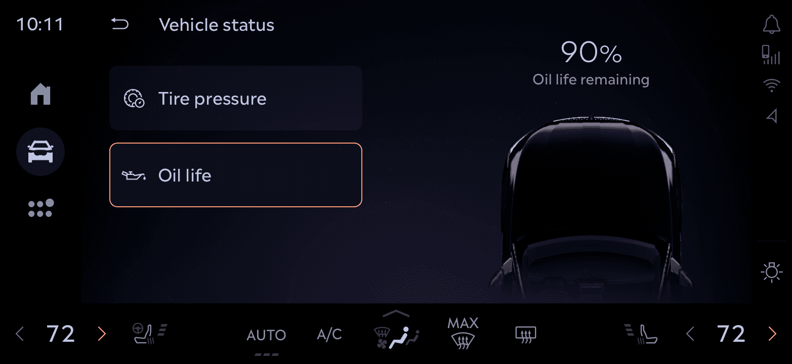
The final solution
We designed a flexible framework that adapts to driving context - minimizing distractions while still supporting rich vehicle interactions when needed. The focus was on clarity, safety, and spatial awareness.
System architecture
Interface breakdown
A sliced view of the final interface highlighting key functional zones - from the access panel and vehicle avatar to control tiles - showing how each area supports different user intents with clarity and consistency.

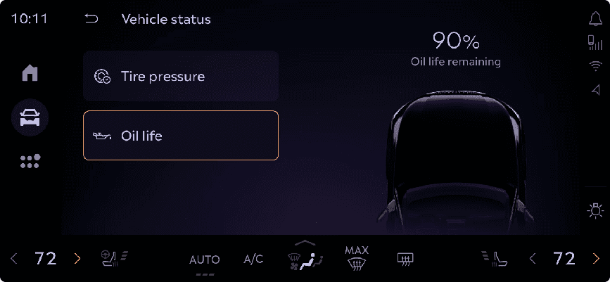
System in action
A look at how various control modules like Vehicle Status, Parental Controls, Lighting, and more leverage this system. Some tap into the 3D avatar for immersive feedback, others remain lightweight for speed.


Impact & adoption
Our design significantly improved usability and consistency across in-vehicle controls.
Wards 10 Best Interior & UX (Ford Expedition) · MotorTrend Best Tech for Infotainment 2025 (Lincoln)
Learnings
Practical takeaways that shaped the product and my design approach.
Prioritization creates focus
Identifying high-frequency, high-value tasks ensured the interface delivered on the user’s most immediate needs - organizing controls by usage frequency. This guided both layout and feature prominence.
Hierarchy reduces friction
Thoughtful grouping and layering of controls minimized cognitive load and made navigation more intuitive, even under motion constraints.
Iterative design is essential
Fast feedback loops with both users and engineers helped us uncover friction early. We tested hypotheses, discarded weak ideas, and doubled down on what worked.
More Ford & Lincoln work
Vehicle Controls was the first framework I built at Ford. A few other shipped projects from the same five years follow - most still under NDA, available for a walkthrough on request.
In-Car Amazon Alexa
I collaborated with designers and product managers at Amazon to make Alexa feel native to Ford and Lincoln's interface.
By refining visual styles, interaction patterns, and system behaviors, I made the Alexa integration feel like a natural extension of the vehicle's interface, not an external add-on. The outcome: kept Alexa's core functionality while establishing cohesion with Ford and Lincoln's UI system.


Valet Mode
Handing over your car shouldn't mean compromising your privacy.
Designed Valet Mode for Ford and Lincoln vehicles, so users can securely hand over their car while protecting personal data and settings. The feature restricts access to sensitive info like navigation history, and limits specific vehicle functions for privacy and security. Streamlined the user flow and integrated it cleanly into the infotainment system.


Coming soon
More shipped Ford work being cleared for publication. Towing & trailering education. Voice assistant flows. In-vehicle entertainment systems. Case studies in progress. Reach out for a walkthrough.